Windows Aero

Windows Aero (a backronym for Authentic, Energetic, Reflective, and Open, or simply AERO or Aero),[1] also known as Aero Glass, is a set of interface and design guidelines that were introduced by the Windows Vista operating system. The changes made in the Aero interface affected many elements of the Windows interface, including the incorporation of a new look, along with changes in interface guidelines reflecting appearance, layout, and the phrasing and tone of instructions and other text in applications.
History
Windows Vista
The Aero interface was unveiled for Windows Vista as a complete redesign of the Windows interface, replacing Windows XP's "Luna" theme. Until the release of Windows Vista Beta 1 in July 2005, little had been shown of Aero in public or leaked builds. Previous user interfaces were Plex, which was featured in Longhorn builds 3683–4039; Slate, which was featured in build 4042 and was available until build 4093; and Jade (builds 4074, 4083 and 4093). Microsoft started using the Aero theme in public builds in build 5048. The first build with full-featured Aero was build 5219. Build 5270 (released in December 2005) contained an implementation of the Aero theme which was virtually complete, according to sources at Microsoft, though a number of stylistic changes were introduced between then and the operating system's release.
Windows Aero incorporated the following features in Windows Vista.
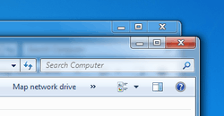
- Aero Glass theme: The main component of Aero, it is the successor of Windows XP's "Luna" and changes the look and feel of graphical control elements, including but not limited to buttons, checkboxes, radio buttons, menus, progress bars and default Windows icons. Even message boxes are changed.[2]
- Windows Flip improvements: Windows Flip (Alt+Tab) in Windows Vista now shows a live preview of each open window instead of the application icons.[3]
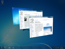
- Windows Flip 3D: Windows Flip 3D (Windows key+Tab) renders live images of open windows, allowing one to switch between them while displaying them in a three-dimensional view.[4]
- Taskbar live thumbnails – Hovering over the taskbar button of a window displays a preview of that window in the taskbar.
- Desktop Window Manager (DWM) – Due to the significant impact of the new changes on hardware and performance, Desktop Window Manager was introduced to achieve hardware acceleration, transferring the duty of UI rendering from CPU to graphic subsystem. DWM in Windows Vista required compatible hardware.
- Task Dialogs: dialog boxes meant to help communicate with the user and receive simple user input. Task Dialogs are more complex than traditional message boxes that only bear a message and a set of command buttons. Task Dialogs may have expandable sections, hyperlinks, checkboxes, progress bars and graphical elements.[5]
Windows 7
Windows Aero is revised in Windows 7, with several UI changes, such as a more touch friendly interface, and many new visual effects and features including mouse gestures:


- Aero Peek: Hovering over a taskbar thumbnail shows a preview of the entire window. Aero Peek is also available through the "Show desktop" button at the right end of the taskbar, which makes all open windows transparent for a quick view of the desktop. A similar feature was patented during Windows Vista development.[6]
- Aero Shake: Shaking (quickly dragging back and forth) a window minimizes all other windows. Shaking it again brings them back.
- Aero Snap: Dragging a window to the right or left side of the desktop causes the window to fill the respective half of the screen. Snapping a window to the top of the screen maximizes it. Windows can be resized by stretching them to touch the top or bottom of the screen, which fully increases their vertical screen estate, while retaining their width, these windows can then slide horizontally if moved by the title bar, or pulled off, which returns the window to its original height. In spite of the "Aero" moniker, this feature is available if one uses the Classic theme.
- Touch UI enhancements: Windows Aero was revised to be more touch-friendly. For example, touch gestures and support for high DPI on displays were added.[7]
- Title bar of maximized windows remain transparent instead of becoming opaque.
- The outline of non-maximized windows is completely white, rather than having a cyan outline on the right side and bottom.
- When hovering over the taskbar button of an open program, the button glows the dominant RGB color of its icon, with the effect following the mouse cursor.[8]
- Progress indicators are present in taskbar buttons. For example, downloading a program through Internet Explorer causes the button to fill with color as the operation progresses.[9]
Windows 8/8.1
While retaining interface elements introduced by Vista and 7, Windows 8 and Windows Server 2012 made changes to the visual appearance of the operating system that incorporate the Metro design language. As a result of these changes, the Aero Glass theme was replaced by a flatter, solid colored theme. Most transparency effects were removed from the interface, aside from the taskbar, which maintains transparency (but no longer has a blur effect).[10][11] Flip 3D was also removed; ⊞ Win+Tab ↹ now switches between Modern apps.
In comparison to Windows 7, the interface adopted a flatter look with almost no transparency effects, fewer rounded edges, and solid colored window borders, despite many commenters' protests. Pre-release versions of Windows 8 used an updated version of Aero Glass with a flatter, squared look, but the Glass theme was ultimately removed for the final version.[12][13]
Windows 10 onwards
Windows 10 continues with this design pattern, but optional transparency and Aero-like blur effects were also restored in certain locations (such as on the Start menu, Action Center, and calendar and volume pop-ups) similar to OS X Yosemite and iOS 7, new system icons with a flatter and minimalistic appearance, and ⊞ Win+Tab ↹ activating the new "Task View" mode which toggles between virtual desktops. The color of the title bar was locked to a solid white in Windows 10 RTM (build 10240) and the accent color only affected the Start Menu and the 1-pixel border around active windows. Windows 10 November Update (Version 1511) added the option to change the color of both the Task Bar and Title Bar to the accent color or to the user's preference, and in Windows 10 Version 1607 (Redstone) these options are separated so users can choose to change only the color of the Title Bar, or both.
Features
For the first time since the release of Windows 95, Microsoft completely revised its user interface guidelines, covering aesthetics, common controls such as buttons and radio buttons, task dialogs, wizards, common dialogs, control panels, icons, fonts, user notifications, and the "tone" of text used.[14][15]
Aero Glass theme

On Windows Vista and Windows 7 computers that meet certain hardware and software requirements, the Aero Glass theme is used by default, primarily incorporating various animation and transparency effects into the desktop using hardware acceleration and the Desktop Window Manager (DWM). In the "Personalize" section added to Control Panel of Windows Vista, users can customize the "glass" effects to either be opaque or transparent, and change the color it is tinted. Enabling Aero Glass also enables other new features, including an enhanced Alt-Tab menu and taskbar thumbnails with live previews of windows, and "Flip 3D", a window switching mechanism which cascades windows with a 3D effect.
Windows 7 features refinements in Aero Glass, including larger window buttons by default (minimize, maximize, close and query), revised taskbar thumbnails, the ability to manipulate windows by dragging them to the top or sides of the screen (to the side to make it fill half the screen, and to the top to maximize), the ability to hide all windows by hovering the Show Desktop button on the taskbar, and the ability to minimize all other windows by shaking one.
Use of DWM, and by extension the Aero Glass theme, requires a video card with 128 MB of graphics memory (or at least 64 MB of video RAM and 1 GB of system RAM for on-board graphics) supporting pixel shader 2.0, and with WDDM-compatible drivers. Aero Glass is also not available in Windows 7 Starter, is only available to a limited extent on Windows Vista Home Basic, and is automatically disabled if a user is detected to be running a non-genuine copy of Windows.[16][17] Windows Server 2008 and Windows Server 2008 R2 also support Aero Glass as part of the "Desktop Experience" component, which is disabled by default.[18]
On Windows 8 and Windows Server 2012, DWM is permanently enabled on all systems; additionally, DWM can now use software rendering on incompatible graphics hardware.[19]
Aero Wizards

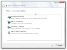
Wizard 97[20] had been the prevailing standard for wizard design, visual layout, and functionality used in Windows 98 through to Windows Server 2003, as well as most Microsoft products in that time frame. Aero Wizards are the replacement for Wizard 97, incorporating visual updates to match the aesthetics of the rest of Aero, as well as changing the interaction flow.
More specifically:
- To increase the efficiency of the wizard, the "Welcome" pages in Wizard 97 are no longer used. (A precursor to this change was implied in a number of wizards in products such as SQL Server 2005 where a check-box was added to welcome pages, allowing a user to disable the welcome page in future uses of the wizard.)
- Aero Wizards can be resized, whereas the Wizard 97 guidelines defined exact sizes for wizard window and content sizes.
- The purpose of Aero Wizards are more clearly stated at the top.
- A new kind of control called a "Command link" provides a single-click operation to choose from a short list of options.
- The notion of "Commit pages" is introduced, where it is made clear that the next step will be the actual process that the wizard is being used to enact. If no follow-up information needs to be communicated, these are the last pages in a wizard. Typically a commit page has a button at the bottom-right that is labeled with the action to be taken, such as "Create account".
- The "Back" button has moved to the top-left corner of the wizard window and matches the visual style of the back button in other Vista applications. This is done to give more focus to the commit choices. The "Next" button is only shown on pages where it is necessary.
- At the end of a wizard, a "Follow-up page" can be used to direct the user to related tasks that they may be interested in after completing the wizard. For example, a follow-up for a CD burning wizard may present options like "Duplicate this disc" and "Make a disc label".
Notifications
Notifications allow an application or operating system component with an icon in the notification area to create a pop-up window with some information about an event or problem. These windows, first introduced in Windows 2000 and known colloquially as "balloons", are similar in appearance to the speech balloons that are commonly seen in comics. Balloons were often criticized in prior versions of Windows due to their intrusiveness, especially with regard to how they interacted with full-screen applications such as games (the entire application was minimized as the bubble came up). Notifications in Aero aim to be less intrusive by gradually fading in and out, and not appearing at all if a full-screen application or screensaver is being displayed—in these cases, notifications are queued until an appropriate time.[21] Larger icons and multiple font sizes and colors are also introduced with Aero's notification windows.
Font

The Segoe UI typeface is the default font for Aero with languages that use Latin, Greek, and Cyrillic character sets. The default font size is also increased from 8pt to 9pt to improve readability. In the Segoe UI typeface prior to Windows 8, the numeral zero ("0") is narrow, while capital letter "O" is wider (Windows 8's Segoe UI keeps this difference), and numeral one ("1") has a top hook, while capital letter "I" has equal crown and base (Windows 8's "1" has no base, and the "I" does not have a crown or base).
Icons
Aero's base icons were designed by The Iconfactory, which had previously designed Windows XP icons.[22]
Phrasing tone
The Vista User Experience Guidelines also address the issue of "tone" in the writing of text used with the Aero user interface. Prior design guidelines from Microsoft had not done much to address the issue of how user interface text is phrased, and as such, the way that information and requests are presented to the user had not been consistent between parts of the operating system.
The guidelines for Vista and its applications suggest messages that present technically accurate advice concisely, objectively, and positively, and assume an intelligent user motivated to solve a particular problem. Specific advice includes the use of the second person and the active voice (e.g. "Print the photos on your camera") and avoidance of words like "please", "sorry" and "thank you".[23]
See also
- Aqua (user interface)
- Compiz
- Compositing window manager
- Desktop Window Manager
- Development of Windows 7
- Development of Windows Vista
- Features new to Windows 7
- Features new to Windows Vista
- Kwin
- Metro Design Language
- Windows Vista hardware requirements
References
- ↑ Allchin, Jim (November 9, 2006). "The Sounds of Windows Vista". Windows Vista Team Blog. Microsoft. Archived from the original on 10 November 2006. Retrieved April 25, 2015.
- ↑ "Message boxes differ in Windows Vista and in Windows XP, although you use the same code to generate the message boxes". Support. Microsoft. Retrieved 16 June 2013.
- ↑ "What is Windows Aero?". Windows Portal. Microsoft. Retrieved 11 June 2013.
- ↑ "Using Windows Flip 3D". Windows Portal. Microsoft. Retrieved 11 June 2013.
- ↑ "About Task Dialogs". MSDN. Microsoft. Retrieved 16 June 2013.
- ↑ Zheng, Long (30 November 2008). "From Microsoft patent to Windows reality: "X-ray browsing", circa 2005; Aero Peek, circa 2008.". iStartedSomething.com. iStartedSomething. Retrieved 11 June 2013.
- ↑ Townsend, Reed; Matthews, Dave; LeGrow, Ian. Sinofsky, Steven, ed. "Touching Windows 7". Engineering Windows 7. Microsoft. Retrieved 30 November 2008.
- ↑ What's new in Windows 7: Faster & easier Archived 26 February 2009 at the Wayback Machine.
- ↑ Kiriaty, Yochay; Goldshtein, Sasha (July 2009). "Introducing The Taskbar APIs". MSDN Magazine. Microsoft. Retrieved 10 November 2013.
- ↑ "RIP Aero Glass; Windows 8 Sticks a Fork in Familiar UI". PC Magazine. Ziff Davis. 19 May 2012. Retrieved 20 May 2012.
- ↑ Harris, Jensen (18 May 2012). "Creating the Windows 8 user experience". Retrieved 24 June 2012.
- ↑ Webster, Andrew (18 May 2012). "Microsoft reveals Windows 8 desktop UI changes, drops Aero Glass". The Verge. Vox Media. Retrieved 12 June 2013.
- ↑ Harris, Jensen (19 May 2012). Sinofsky, Steven, ed. "Creating the Windows 8 user experience". Building Windows 8. Microsoft. Retrieved 21 May 2012.
- ↑ "What's New in Windows Vista". Windows Vista User Experience Guidelines. Microsoft. Retrieved 12 June 2013.
- ↑ Allchin, Jim (10 November 2006). "The Sounds of Windows Vista". Windows Vista Team Blog. Microsoft. Archived from the original on 10 November 2006. Retrieved 16 June 2013.
- ↑ "Windows Vista Enterprise Hardware Planning Guidance". TechNet Library. Microsoft. February 2007. Retrieved 12 June 2013.
- ↑ Fried, Ina (13 April 2006). "Vista won't show fancy side to pirates". CNET. CBS Interactive. Retrieved 12 June 2013.
- ↑ "Desktop Experience Overview". TechNet Library. Microsoft. Retrieved 16 June 2013.
- ↑ "Desktop Window Manager is always on". Windows 8 and Windows Server 2012 Compatibility Cookbook. Microsoft. 28 November 2012. Retrieved 12 June 2013.
- ↑ "Wizard 97". Platform SDK. Microsoft. May 2002. Retrieved 12 June 2013.
- ↑ "Notifications". MSDN. Microsoft. Retrieved April 18, 2015.
- ↑ "Design: Windows Vista". iconfactory.com. The Iconfactory. Retrieved 12 June 2013.
- ↑ "Text". Windows Vista User Experience Guidelines. Microsoft. June 2008. Retrieved 12 June 2013.
.svg.png)