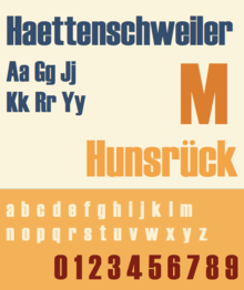
Haettenschweiler
 | |
| Category | Sans-serif |
|---|---|
| Classification | Realist |
| Designer(s) | Walter Haettenschweiler |
| Foundry | Microsoft |
Haettenschweiler is a sans-serif typeface in the realist style, that is very bold and condensed. It is intended for headlines and display text.
Schmalfette Grotesk
Versions of the font that are now commonly used are descend from an upper-case only design called Schmalfette Grotesk (German for bold condensed sans-serif) by Walter Haettenschweiler that was published in 1954.
Schmalfette was published in the book Lettera 4 (1954) which Haettenschweiler had written with Armin Haab.[1] The Lettera series collected lettering designs (mostly hand-painted) and original designs, and was often used by designers as a source of inspiration.[2][3][4]
An early reuse of the design was in the German young peoples' magazine Twen.[5] Microsoft's history of the font notes that after Lettera 4 was published the design 'was immediately picked up by designers at Paris Match who cut up pictures of it to make headlines' until it was publicly released. Similar methods were also used by British designers, as it was not available in Britain.[6][7]
Adaptations and digitisation
The Haettenschweiler font in common modern use descends from a phototypesetting adaptation by the company Photoscript, who created a lower-case for it.[8] Haettenschweiler himself did not receive payment or royalties for this font, which is now bundled with much Microsoft software in a digitisation credited to Eraman Ltd. and Monotype Imaging.[9][10] He commented: "I never received a single cent, but at least they named it after me."[11]
Aesthetic
Haettenschweiler's highly compact, tightly spaced and industrial design is a prominent example of the aggressive, menacing style of graphic design that despite its poor legibility was popular in the 1960s and 70s, and was often used for purposes besides newspapers, such as book covers.[12]
This type of design has been criticised for having low legibility in smaller point sizes, in situations with low contrast between background and text colours, or at a distance, with (for example) 8 and 9 seeming very similar. Counters are minimal and normally fully enclosed, a common feature of 'Grotesk' typefaces, while apertures are very narrow. This folded-up effect gives it a striking appearance at the cost of legibility. The problems are particularly large in a lower-case (which, as previously noted, Haettenschweiler himself declined to design), where the fine detail of the characters mean that strokes run closer together than in the capitals.[13]
Related typefaces
Several fonts were created in the same style in the early-to-mid 1960s, including Helvetica Inserat and British imitators Compacta and Impact. Haettenschweiler has narrower characters than Impact. Geoffrey Lee, who designed Impact in 1963, wrote that "many of us admired the vitality and colour of what we knew only as Schmalfette, and used it by old-fashioned cut and paste. Use was limited as it was never made in metal as far as I know, and existed then in capitals and numerals only."[14] Lee wrote that a motivation for designing Impact was to allow a similar design to be used by British designers, since at the time continental metal type was expensive and complex for British companies to license and use. He also commented that he felt that the lower-case characters added were not so useful: "Later someone added (or found) a lowercase for its new existence. I personally find the style lacks the attractive feel of the caps." Matthew Carter would later design Helvetica Compressed for similar reasons.[15]
A number of alternative digitisations of Schmalfette exist. A custom digitisation is used for the American television show "Charlie Rose" for branding.[16] Another is "Schmalfette CP", by CounterPoint Type Studio.
Usage
A 2010 Princeton University study involving presenting students with text in a font slightly more difficult to read found that they consistently retained more information from material displayed in so-called disfluent or ugly fonts (Monotype Corsiva, Haettenschweiler, Comic Sans Italicized were used) than in a simple, more readable font such as Arial.[17]
It is used in the Nottingham Forest logo, with a modified R and a lowercase E at upper-case height; it is also used for the Solace Systems logo.
Bibliography
- Haettenschweiler, Walter and Armin Haab. Lettera 4: a standard book of fine lettering. Hastings House, 1972.
References
- ↑ "Entwerfer und Gestalter". Webpaper.nzz.ch. Retrieved 4 October 2016.
- ↑ . ISBN 0803842821. Missing or empty
|title=(help) - ↑ . ISBN 9780803842823. Missing or empty
|title=(help) - ↑ "Grafiker «Haetti» ist gestorben". Zugcultur.ch. Retrieved 4 October 2016.
- ↑ "Walter Haettenschweiler. Obituary". Form.de. Retrieved 4 October 2016.
- ↑ Dempsey, Mike. "Schmalfette: Tall, dark and handsome". Graphic Journey. Retrieved 22 August 2015.
- ↑ Dempsey, Mike. "Blast from the past". Design Journey. Retrieved 23 August 2015.
- ↑ Dempsey, Mike. "Walter Haettenschweiler 1933 – 2014". Graphic Journey. Retrieved 23 August 2015.
- ↑ "Haettenschweiler font information". Microsoft. Retrieved 22 August 2015.
- ↑ "Die Microsoft-Schrift aus Zug". Zug Cultur. Retrieved 4 October 2016.
- ↑ "Schmalfette". Fonts in Use. Retrieved 4 October 2016.
- ↑ "Permanent Headline - Fonts in Use". Fonts in Use. Retrieved 17 June 2016.
- ↑ Covert, Adrian. "Why Apple's New Font Won't Work On Your Desktop". FastCoDesign. Retrieved 28 November 2014.
- ↑ Lee, Geoffrey. "Comments on Typophile thread". Typophile (archived). Archived from the original on August 26, 2005. Retrieved 27 October 2014.
- ↑ Drucker, Margaret Re ; essays by Johanna; Mosley, James (2003). Typographically speaking : the art of Matthew Carter (2. ed.). New York: Princeton Architectural. p. 53. ISBN 9781568984278.
- ↑ Coles, Stephen. "Charlie Rose: One of the strongest talk shows on television finally has a typographic identity that carries as much weight.". Fonts in Use. Retrieved 4 October 2016.
- ↑ Diemand-Yauman, C.; Oppenheimer, D. M.; Vaughan, E. B. (2011). "Fortune favors the bold (and the italicized): Effects of disfluency on educational outcomes". Cognition. 118 (1): 111–5. doi:10.1016/j.cognition.2010.09.012. PMID 21040910.