Tasse
 | |
| Category | Sans-serif |
|---|---|
| Designer(s) | Guy Jeffrey Nelson |
| Foundry | Font Bureau, Inc. |
For the piece of medieval armor, see tassets
You might also mean tasse à café
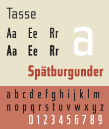
Tasse is a revival of Paul Renner's Steile Futura. The family consists of 4 weights and 5 widths each, but no italic fonts were made. Nelson maintained Renner's alternative characters, adding additional alternate characters. The face is licensed by Font Bureau.
Tasse shows influence of pen-written letters in contrast to the modular geometry of Futura. The face is unusual for a sans-serif in having a true italic rather than a sloped Roman. Lowercase italic a becomes single story, and the suggestion of calligraphic strokes are found in the italic characters e, h, K, k, m, n, and u. Renner's original character set offered alternative, more rounded, versions of uppercase roman characters A, E, M, and W.
References
- Blackwell, Lewis. 20th Century Type. Yale University Press: 2004. ISBN 0-300-10073-6.
- Burke, Christopher. Paul Renner: the art of typography. Hypen Press, London: 1998. ISBN 0-907259-12-X.
- Fiedl, Frederich, Nicholas Ott and Bernard Stein. Typography: An Encyclopedic Survey of Type Design and Techniques Through History. Black Dog & Leventhal: 1998. ISBN 1-57912-023-7.
- Jaspert, W. Pincus, W. Turner Berry and A.F. Johnson. The Encyclopædia of Type Faces. Blandford Press Lts.: 1953, 1983. ISBN 0-7137-1347-X.
- Macmillan, Neil. An A–Z of Type Designers. Yale University Press: 2006. ISBN 0-300-11151-7.
External links
This article is issued from Wikipedia - version of the 11/2/2015. The text is available under the Creative Commons Attribution/Share Alike but additional terms may apply for the media files.